
How Merging Two main Sites Led to a Six-Site Transformation
At a glance
The project
The company ran two main websites with overlapping purposes, audiences, and content — creating duplication, SEO conflicts, and a fragmented user journey.
My role
Led UX and product design end-to-end.
Research, IA, content strategy, component design, and usability testing — stepping in to define Acceptance Criteria in the absence of a dedicated product manager, and collaborating closely with stakeholders and development throughout
Tools
Figma, Lucidchart, Google Analytics, Microsoft Clarity, Jira.
Team
Data associate, research associate, UI designer, graphic designer, copy writer, development team, head of product & stakeholders.
How things evolved
A single, merged platform with a rebuilt information architecture, component system, and content strategy — designed to scale.
Along the way, it became clear the new components could also solve long-standing problems across the company's four other microsites, turning what started as a two-site merge into a six-site transformation.
Table of contents
Context
BFBS operated two main websites with distinct intentions—one user‑focused and one corporate‑focused. In practice, their content, audiences, and functional purpose converged, resulting in duplicated information, outdated corporate pages, and a fragmented user journey. The dual‑site structure also negatively impacted SEO, with overlapping content competing for visibility. Additionally, the corporate site attracted minimal traffic despite requiring ongoing maintenance.
It was clear something needed to change. The project began to find a solution.
Problem framing
To figure out whether the right move was merging the two sites or improving them separately, I started by breaking the problem down into a set of stakeholder questions. The goal was to understand who each site actually served, how different the content really was, why the two-site setup existed in the first place, and how each site was performing today.
How different are the audiences and content across the two sites, really?
Why were the two sites created originally, and how well are they performing now?
What's changed since then that makes merging worth reconsidering?
Of the existing content, what's worth keeping, what can be cut, and is reorganising a realistic alternative to merging?
What's the SEO impact of each scenario — merging vs. keeping both?
What would each option cost in resources and ongoing maintenance?
Which approach holds up best long-term, not just short-term?
Discovery & preliminary research
Sitemaps: I started by creating detailed sitemaps for both sites to map every page, pathway, and hierarchy level, exposing structural gaps, duplicated flows, and navigation complexity.
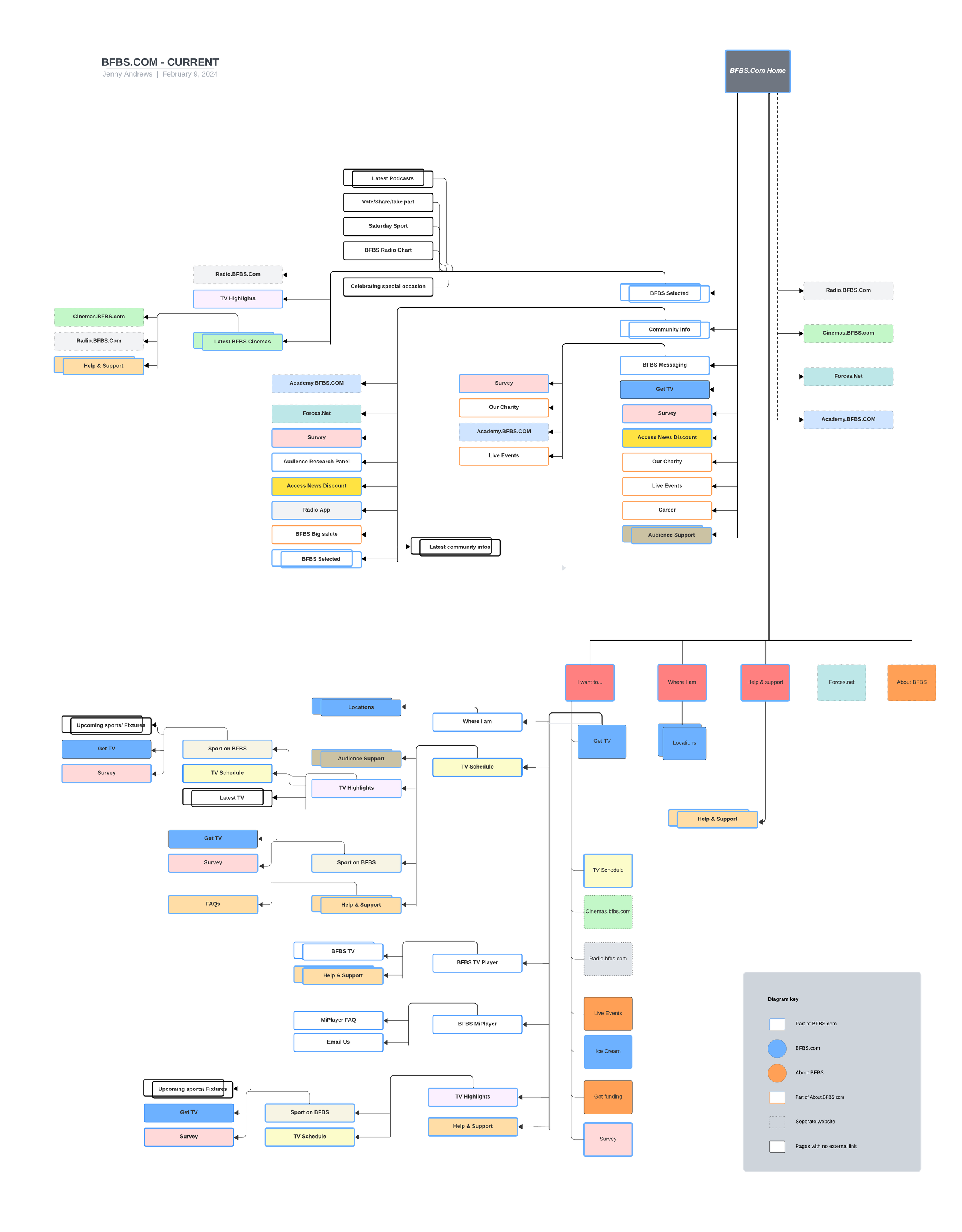
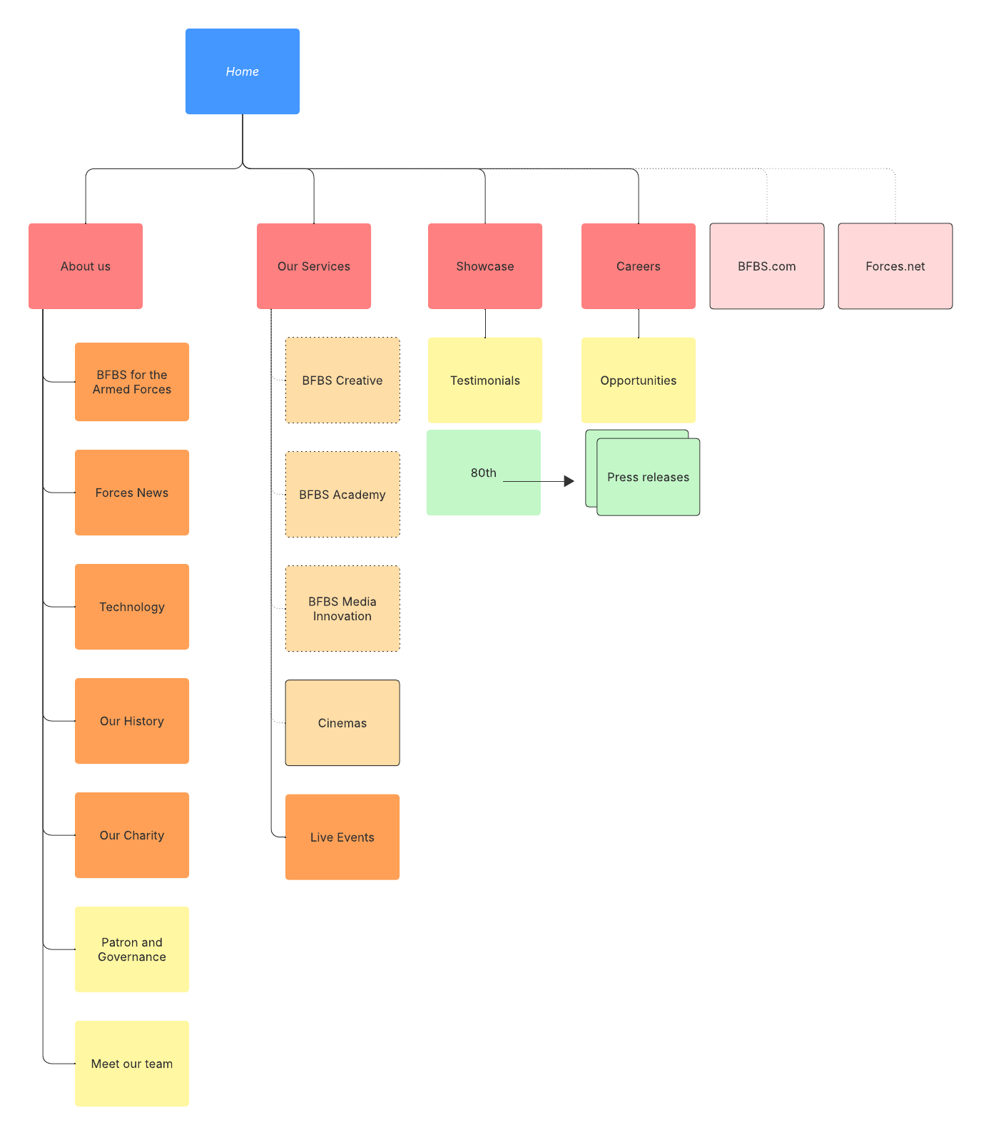
2.Full content and architecture audit (Clarity + GA): Systematically reviewed every piece of content, including microcopy, logos, edge‑case pages etc. to identify friction points, low‑value content, dead‑ends, and misaligned information architecture.
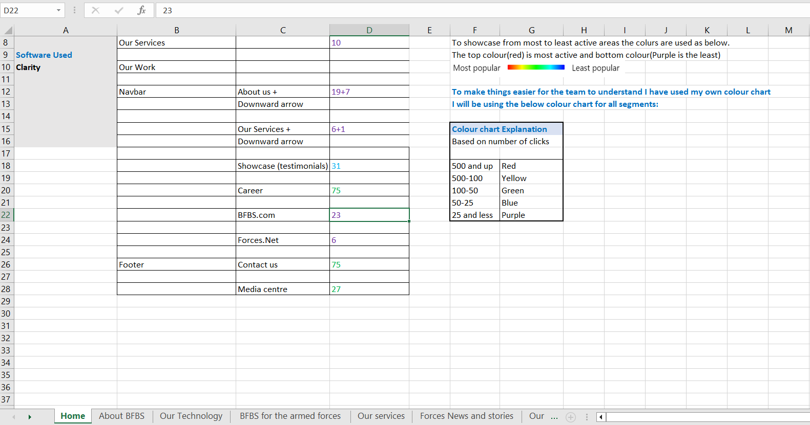
For a clearer picture, I carried out the few extra assessments:
Heuristic evaluation - I reviewed both sites against core usability principles to spot friction, confusing patterns, and areas where the experience felt heavier than it needed to be.
Competitor benchmarking — I compared both sites with relevant competitors to see how their structure, content approach, and navigation patterns differed, and to identify gaps or opportunities.
Technical & AI assessment
Technical audit — I looked into the technical setup of both sites to understand where backend limitations, outdated templates, or CMS inconsistencies were creating friction for users — and for us.
AEO/GEO testing — With AI-driven search becoming a real traffic source, I also tested how well each site performed for AEO/GEO (answer engine optimisation / generative engine optimisation) — essentially, how easily AI tools like ChatGPT or Google's AI Overviews could find, understand, and surface our content.
Stakeholder engagement & project team assembly
Due to the scale of the project and the high impact of it, it was imparative to engage the stakeholders from the very beginning. Once the project group was formed, the stakeholders were encouraged to participate in an array of activities throughout the project cycle. Some of these activities were:
Discovery workshops
Short interviews
Feedback loops
Design walkthroughs
UX writing sessions
Content planning sessions etc.
Content strategy
With a site this size, we couldn't redesign everything at once — so before any design work started, I worked with the marketing team to figure out what actually deserved attention.
Every piece of content got sorted into one of three buckets:
Keep — performing well, still aligned with current goals.
Improve — needed a redesign or structural rework.
Remove — outdated, duplicated, or just no longer earning its place.
This shaped the design roadmap from there. High-traffic service pages and key landing pages went first, a baseline visual structure was planned to lift the rest of the site consistently, and neglected areas were split into their own dedicated projects.
Key pain points
Poor information architecture & CMS
An outdated navbar, footer, and CMS structure made even small improvements difficult to execute.
Unclear hierarchy and inconsistent pathways left the site cluttered, with low content findability.
High-value, high-traffic content — including several key services — was buried, receiving far less visibility than it should.Too many looping of contents, often created due to poor design.
Unnecessary content duplication.
Large number of outdated and unhelpful contents.
Visual limitations
A dated overall look.
Inconsistent use of breadcrumbs.
Minimal use of visual organisers — cards, carousels, and similar patterns — to help structure content.
Accessibility gaps & SEO, AEO, GEO limitations
The existing structure didn't adequately support accessibility best practices, and had gaps limiting SEO, AEO, and GEO performance.
Misalignment between business goals and user needs
The IA reflected internal priorities rather than user behaviour — resulting in a structure that was hard to navigate, buried key content, and served neither user tasks nor business goals effectively.
Project constraints
Merging a large volume of content from two sites, without overwhelming users in the process, was the central challenge.
Careful UX writing for more sensitive content areas.
The implication of changes to the main site on all the other microsites, as they share some of the attributes.
Budget constraints.
Engaging a large number of shareholders while they all had busy schedules.
Design stage 1 - Navigation & footer
The very first design solution was to create a well structured navbar and footer. Which would:
Introduce a 3-layered mega navbar and a 5-column, two-level footer — making a large volume of content easy for users to access and navigate.
Reduce future looping and unnecessary content repetition
Make the structure more adaptive and free of the current CMS limitations, so future growth would be far easier.
Follow research-based UX best practises.
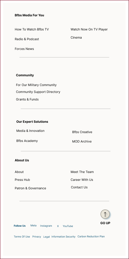
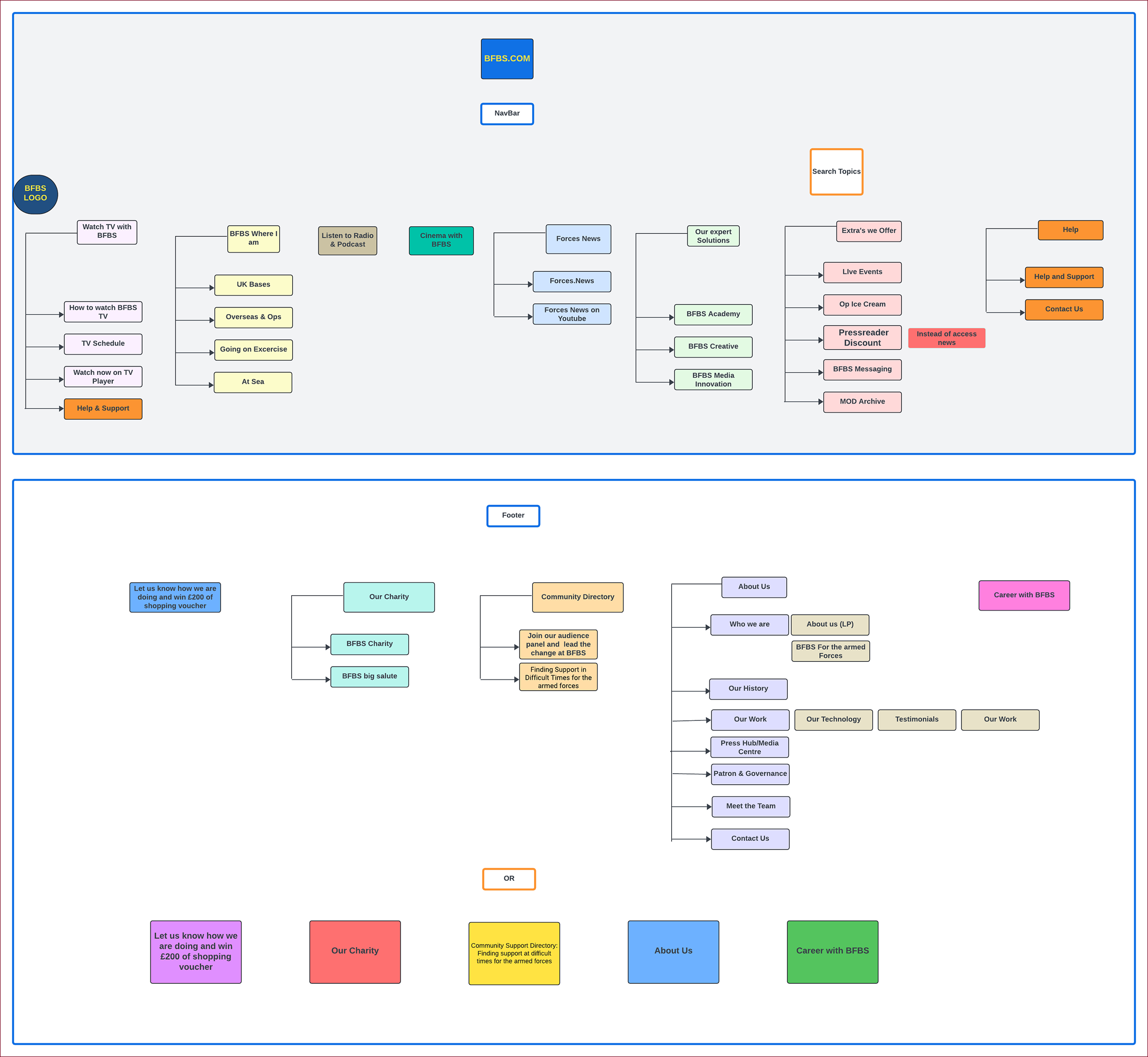
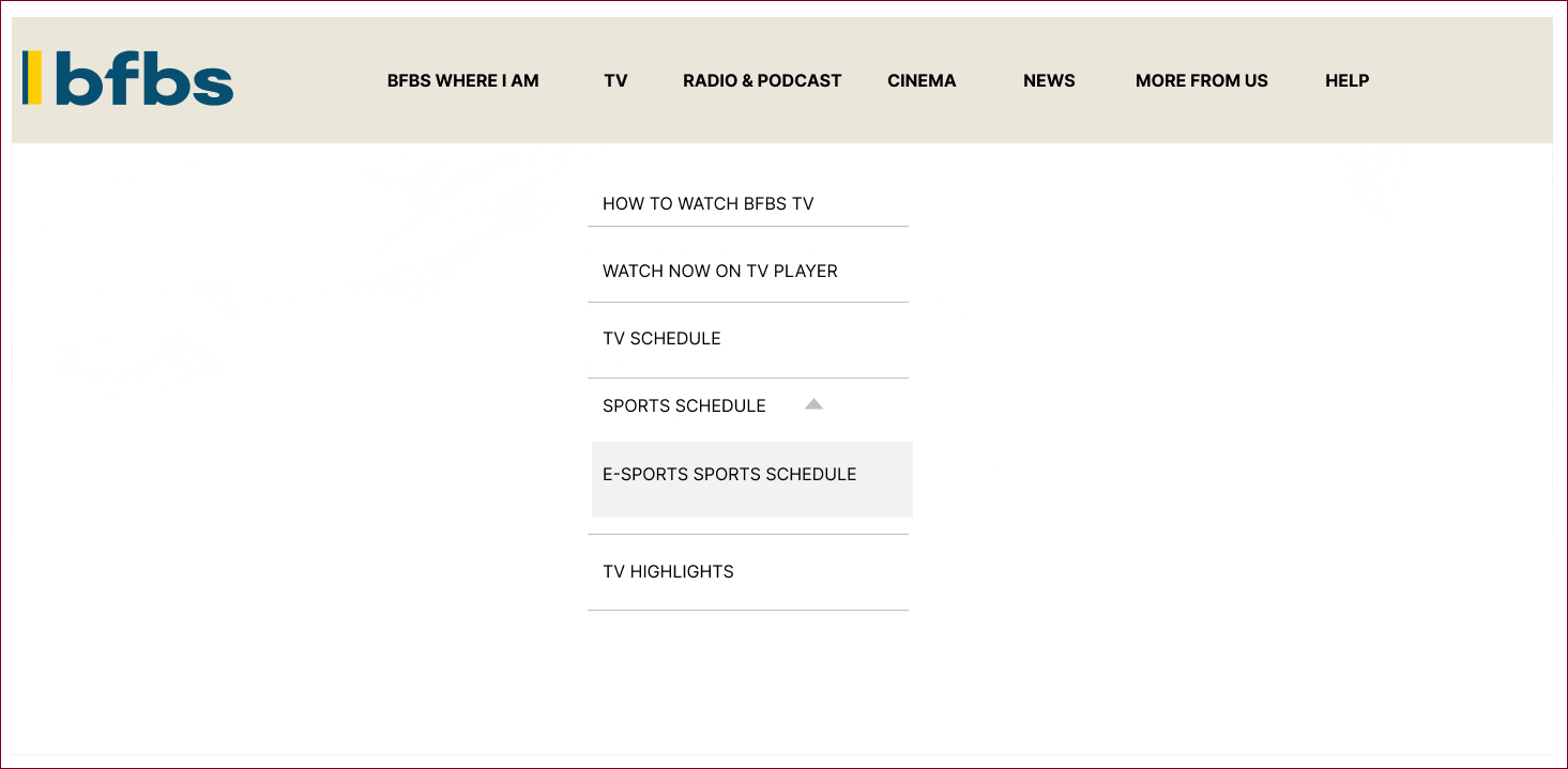
Design stage 2- wireframes & prototypes
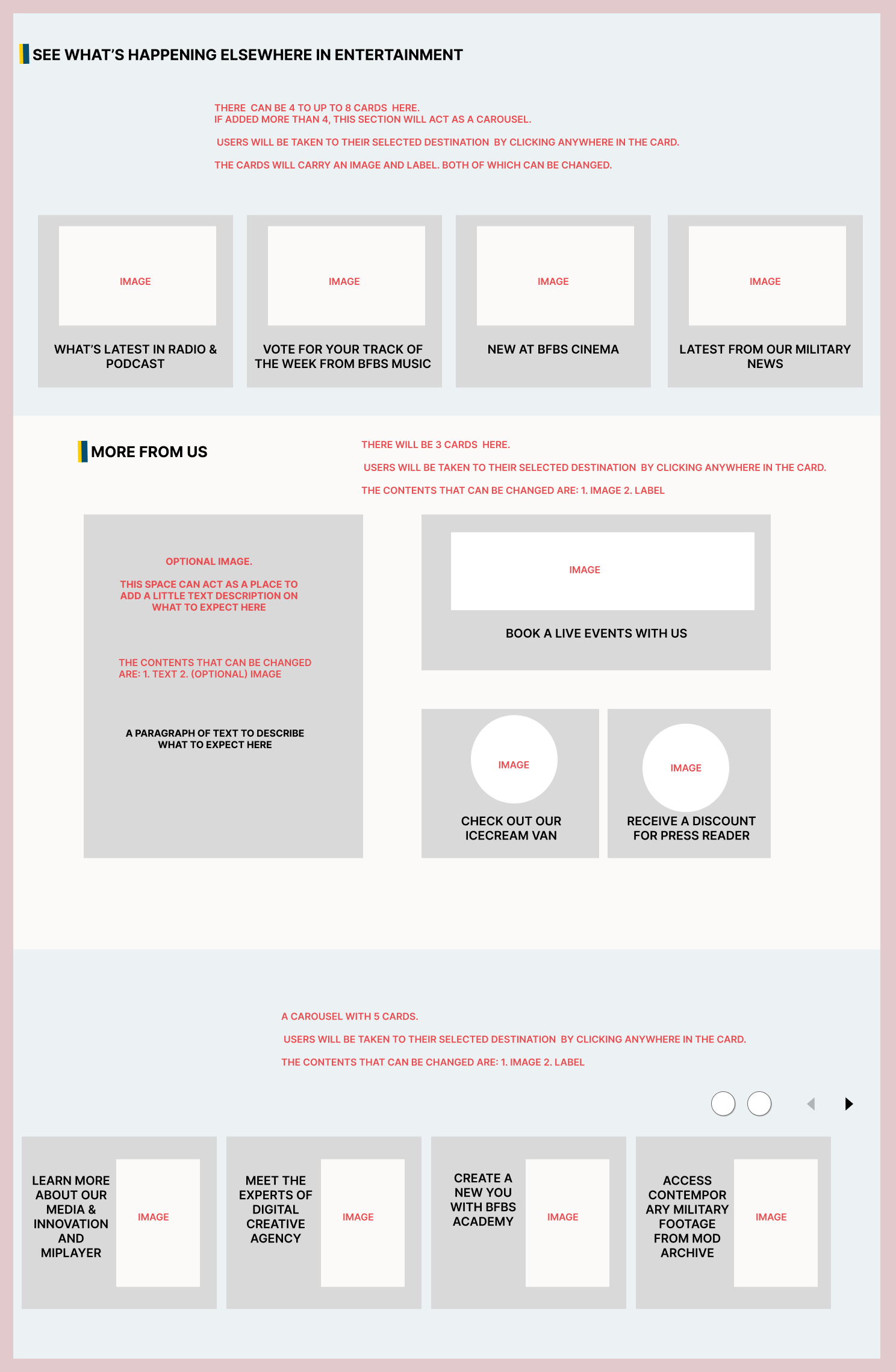
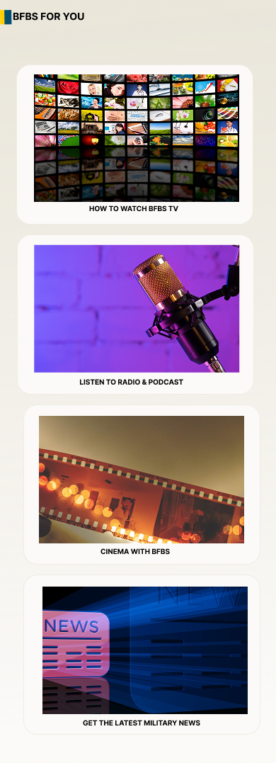
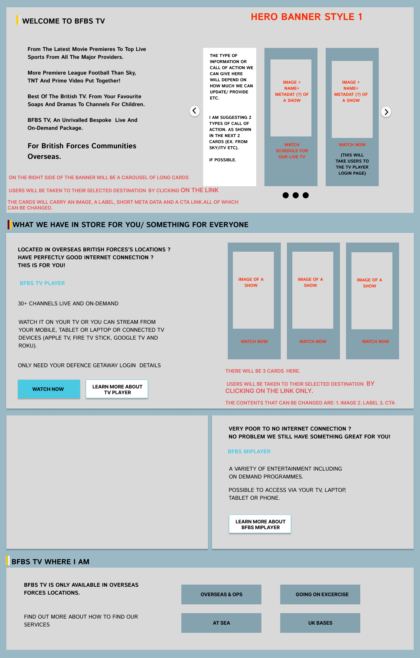
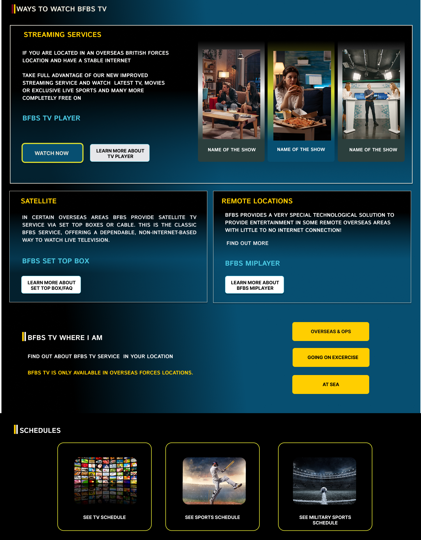

Key design considerations
Build a structure that improves content visibility and findability without adding cognitive load.
Prioritise SEO and an AI enabled (AEO/GEO) ecosystem.
Design with the other microsites in mind, given the attributes they share with the main site.
Reduce duplication and looping across content.
Modernise the overall visual look.
Maintaining the teams need and ease of use while creating a fantastic UX
Address CMS limitations to improve the experience for both content creators and users.
Apply consistent UX writing across all content, headings, and labels — with extra care in sensitive areas.
Add an adaptive AI platform for better search experience.
User testing
Approach: We led multiple rounds of usability testing throughout this project, each focused on a specific design solution, such as general information architecture, visual design, and service-specific IA (such as the section for the company's TV service).
Methodology: Tests were a mix of moderated and unmoderated, task-based formats, depending on what each round needed to answer.
Participants: Each round involved 12 participants, tested across both desktop and mobile.
Based on the results, the design went through several more rounds of refinement before we landed on the final version. A few examples:
Reordered content across pages to better reflect what users actually needed first.
Added more explainer text to clarify how each service could help users.
Simplified how users could contact the company.
Introduced a site search option — which, based on further testing, evolved into the adaptive AI search feature.
Scaling to six sites!
To remove previous complications and support a full refresh, we introduced new components aligned with the updated design, retired older ones that no longer worked well, and identified existing components that needed further refinement.
It was during this process that something became clear — many of these new components and styles could be inherited by the other four microsites, not just the two we were merging. What started as a two-site solution could benefit the entire BFBS ecosystem, while saving significant time and budget across future projects.
This shifted the project from a two-site merge into a six-site design system — expanding both the scope of the work and its impact across
Getting ready for development
To prepare for development, the next step was defining Acceptance Criteria for each component. With no designated product manager on the project, I took this on together with our Product Head and UI Designer.
From there, we worked closely with the development team to make sure all documentation was accurate, buildable, and aligned with the final design.
Collaboration with the development team
We are currently in the development phase, and with our development partners and regular scrum meetings in place, the work is moving forward smoothly.
What’s next
This case study reflects where the project is today — development is underway, but the six-site rollout is still in progress. I'll be updating this case study with results and reflections once the work ships.