End to end UX transformation
At a glance
The problem
The company's Creative Department had grown dissatisfied with their website — low engagement, poor conversion, and several core UX issues holding the experience back.
My role
Led the project end-to-end — research, stakeholder alignment, design strategy, and usability testing, through to collaboration with the development team, QA, and launch.
How things evolved
What started as a request for a simple visual refresh became a full UX overhaul, once stakeholders aligned around the deeper structural issues uncovered through research. The result: a redesigned information architecture, content strategy, and visual identity — designed, tested, and shipped.
Results & impacts
Approx. 60% increase in engagement rate.
Bounce rate improved by around 3%
User enquiries saw a significant rise.
The team
Data associate, research associate, UI designer, development team, stakeholders.
Tools
Figma, Lucid, Canva, Google Analytics, Microsoft Clarity, UserTesting and Jira
Table of contents
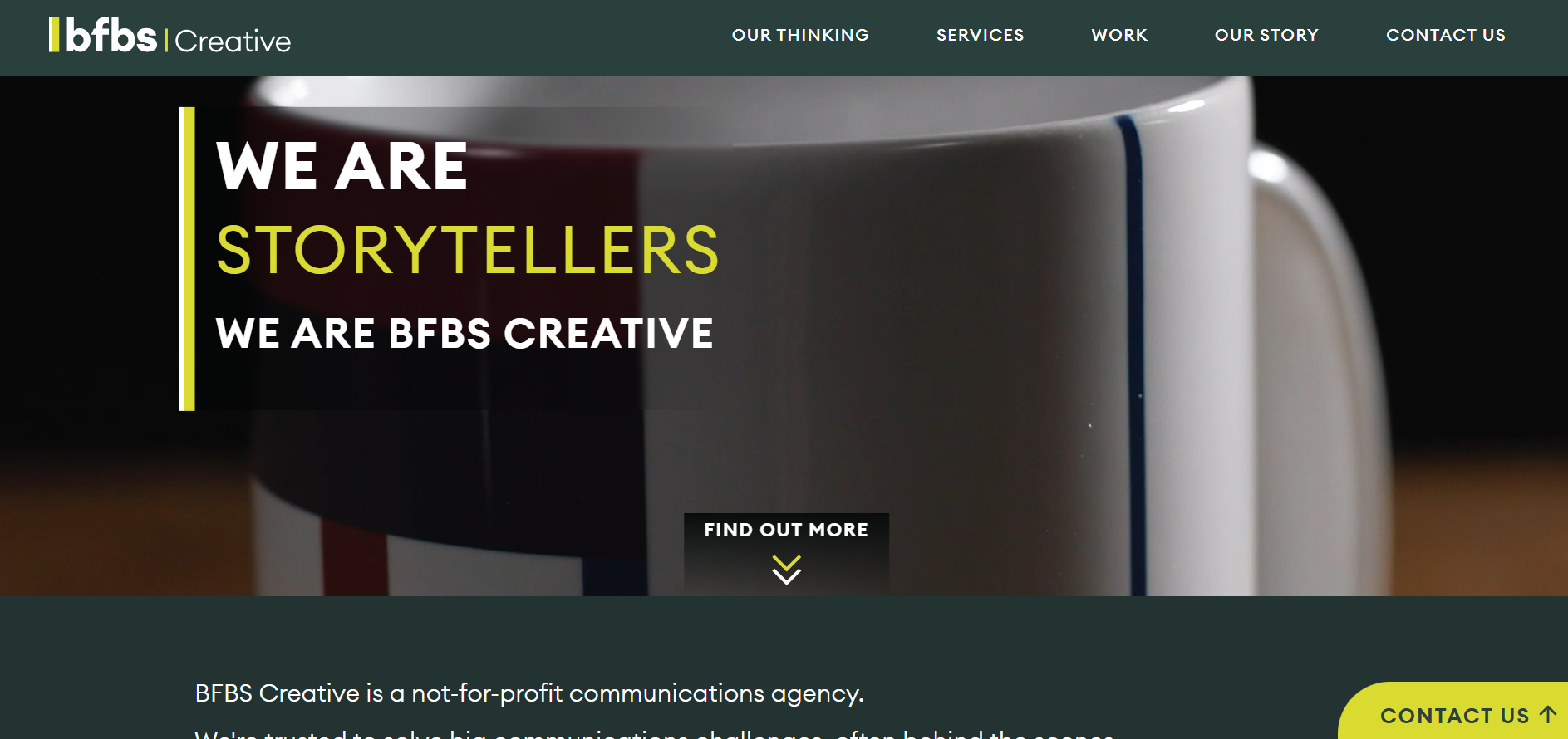
Visit the site: https://creative.bfbs.com/
Context
The company's Creative Department had grown increasingly dissatisfied with their website. Engagement was low, and the few users who did visit rarely converted into meaningful enquiries or purchases.
I took the project on, determined to figure out how the situation could be improved.
Preliminary research
To better understand the situation, I ran the site through a structured set of research methods:
Analytical review using Google Analytics
Heatmap and behaviour analysis using Microsoft Clarity
Navigation and IA assessment
Heuristic evaluation
CMS and technical constraints review
Brand and visual identity assessment


Aligning stakeholders and building the team
With the findings from my preliminary research, it was clear the website needed a full UX overhaul. But within the department, the initial preference was for a visual refresh rather than addressing the deeper structural issues.
I arranged a stakeholder briefing where I presented the team with the key findings and the impact of the current UX gaps. The discussion helped align everyone around the need for a more comprehensive redesign, and we agreed to proceed with a full overhaul.
The next step was to assemble a cross‑disciplinary team — which included departmental members and the design specialists needed for the project.
User and stakeholder interviews
I carried out stakeholder interviews within the Creative Department, alongside interviews with internal users, to understand both departmental needs and real user pain points.
Key problem areas
Structure & content
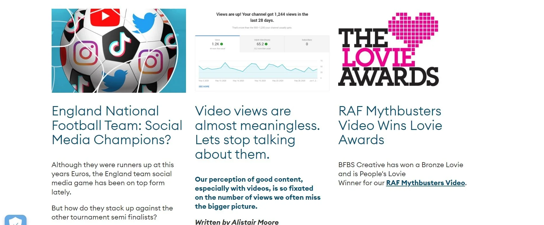
Poor navigation bar with limited structural options.
Poor content structure and hierarchy.
Lacked clear messaging and CTAs — overall, poor UX writing.
Weak engagement tools (e.g., a bare contact form, almost concealed blog pages).
Visual & brand
Unimpressive visuals with no brand personality.
Missed opportunities to differentiate a highly niche agency from its competitors.
Technical & experience
Poor mobile responsiveness.
Inadequate CMS support for proper analytics, making data gathering a nightmare.
Lacked adequate SEO, limiting organic visibility and reach.
Didn't reflect user needs or preferences properly.
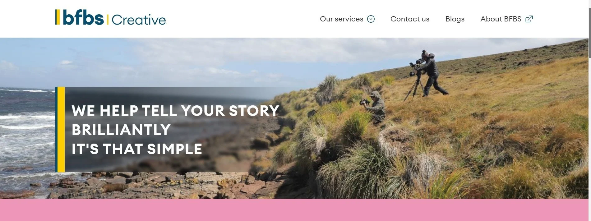
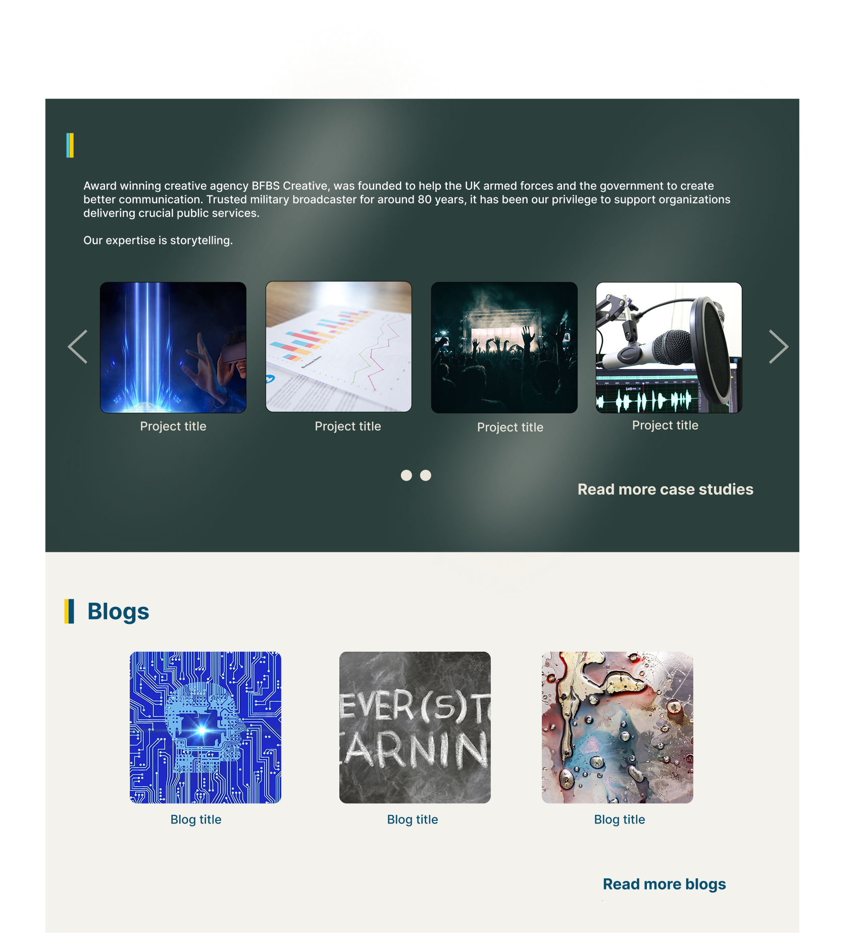
Previous site layout
Define project scope, goal and success metrics
Key scopes
Redesign information architecture and content structure
Refresh the visual design
Improve analytics measurement
Address CMS and technical limitations
Key goals
Improve the overall user experience
Address the uniqueness of the organisation through visual and language cues
Improved SEO/AEO/GEO performance
Support future scalability
Key success metrics
Improved user engagement
Better technical performance
More visitors turning into real enquiries
Project constraints
Tight timeline and limited budget.
Building the right team for the project and aligning multiple stakeholders across departments.
Balancing creative freedom with brand consistency.
Integrating with the company’s broader digital ecosystem.
Navigating technical constraints during development.
Learning to manage team expectations with good UX practices.
Ensuring accessibility and compliance for a specific, sensitive audience.
Design strategy
Focus on the architecture first
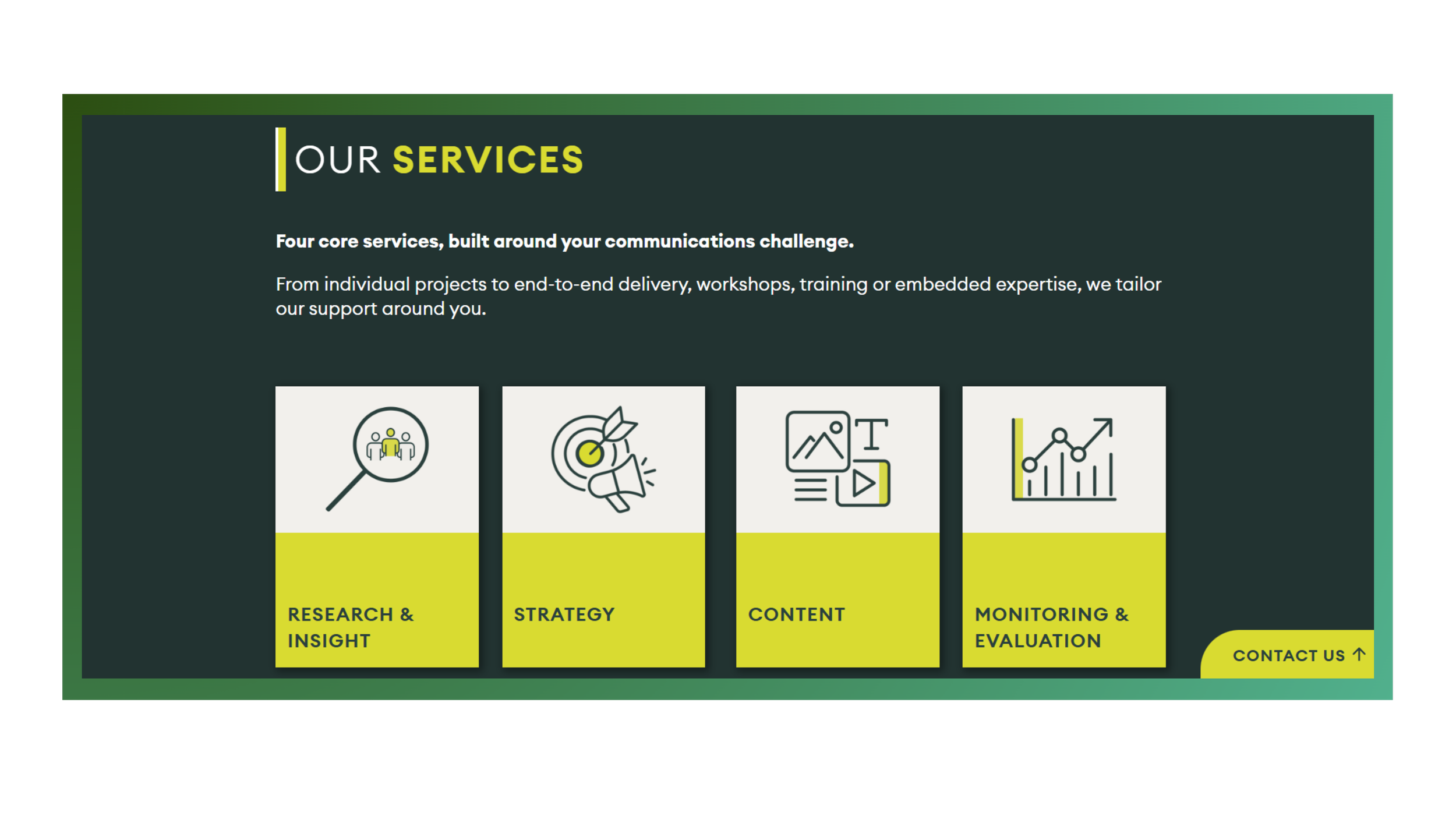
Key focus on a strong structured easy to use navigation - sticky for ease of use.
Reduce cognitive load by making the next step obvious at every stage.
Ensure the site is built to capture data easily, with input from analytics and development
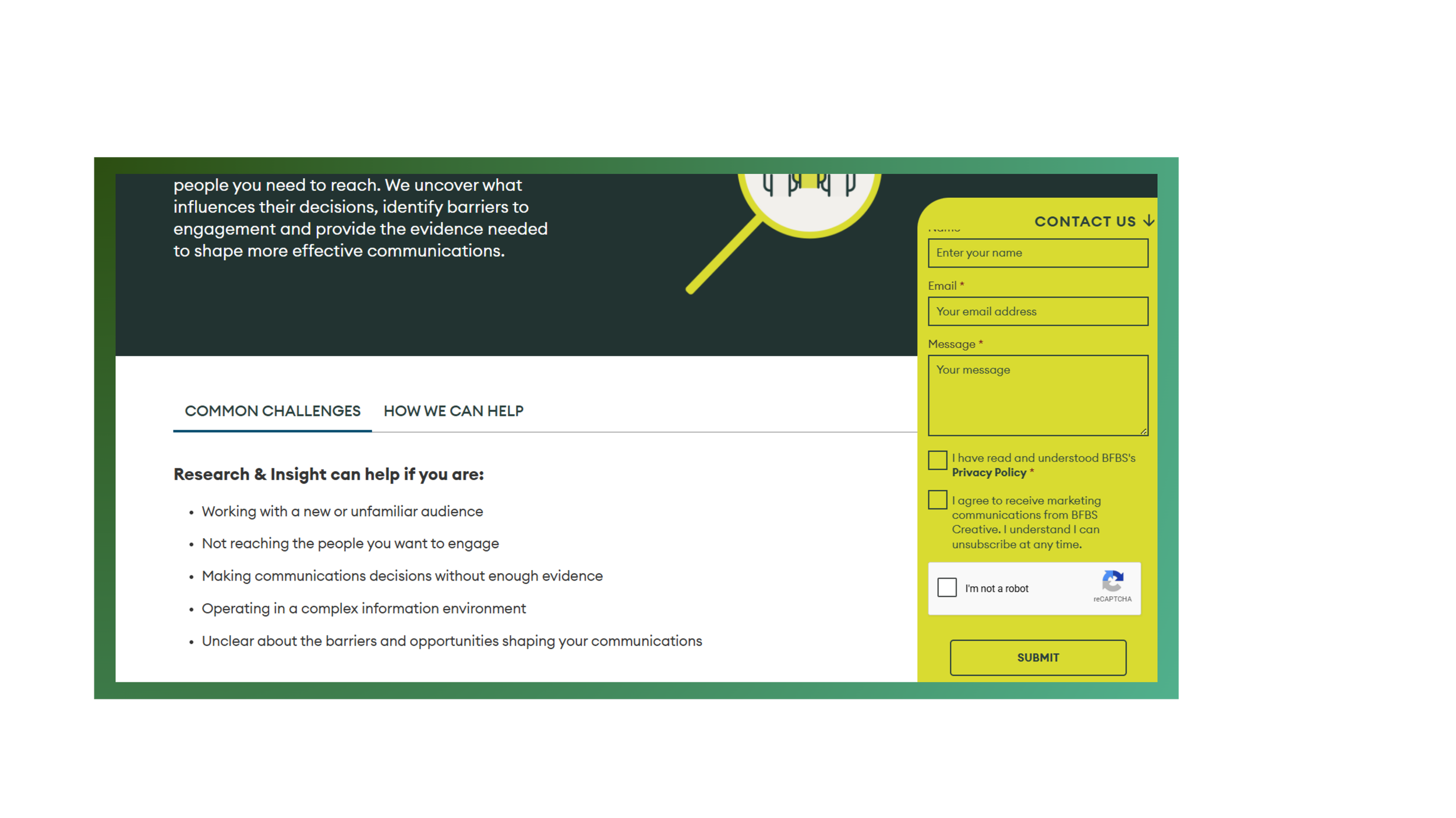
Add a floating contact widget in the corner for easy communication.
Mobile first approach
Utilising good UX practices
Implement all the necessary error messaging options/privacy policy information etc.
Emphasis on UX writing as much as structure and visual. Make sure labels and text structures follow UX rules.
Provide automation wherever applicable
Strong focus towards accessibility
Implementing key UX and accessibility best practices, such as ensuring video content includes a pause control to maintain user agency
Visual considerations
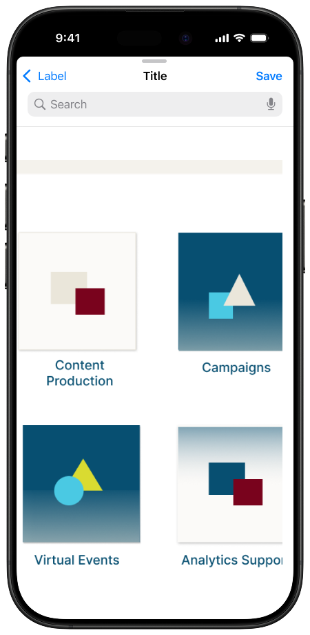
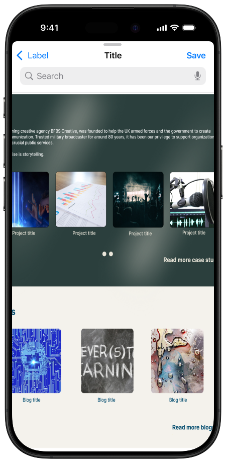
Use of carousels and drop downs to keep contents compact.
Utilise a card structure for a clear content structure.
Integrate media and visuals to showcase the agency’s creative strengths.
Use colour and language to address the agency’s uniqueness and niche target audience to the fullest
Merging user needs with business goals
Regular communication with stakeholders to understand company goals and department needs.
Maintaining the team’s needs and ease of use while creating a fantastic UX
Making the site as much SEO/AEO/GEO friendly as possible.
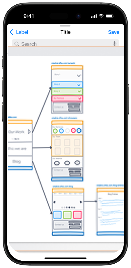
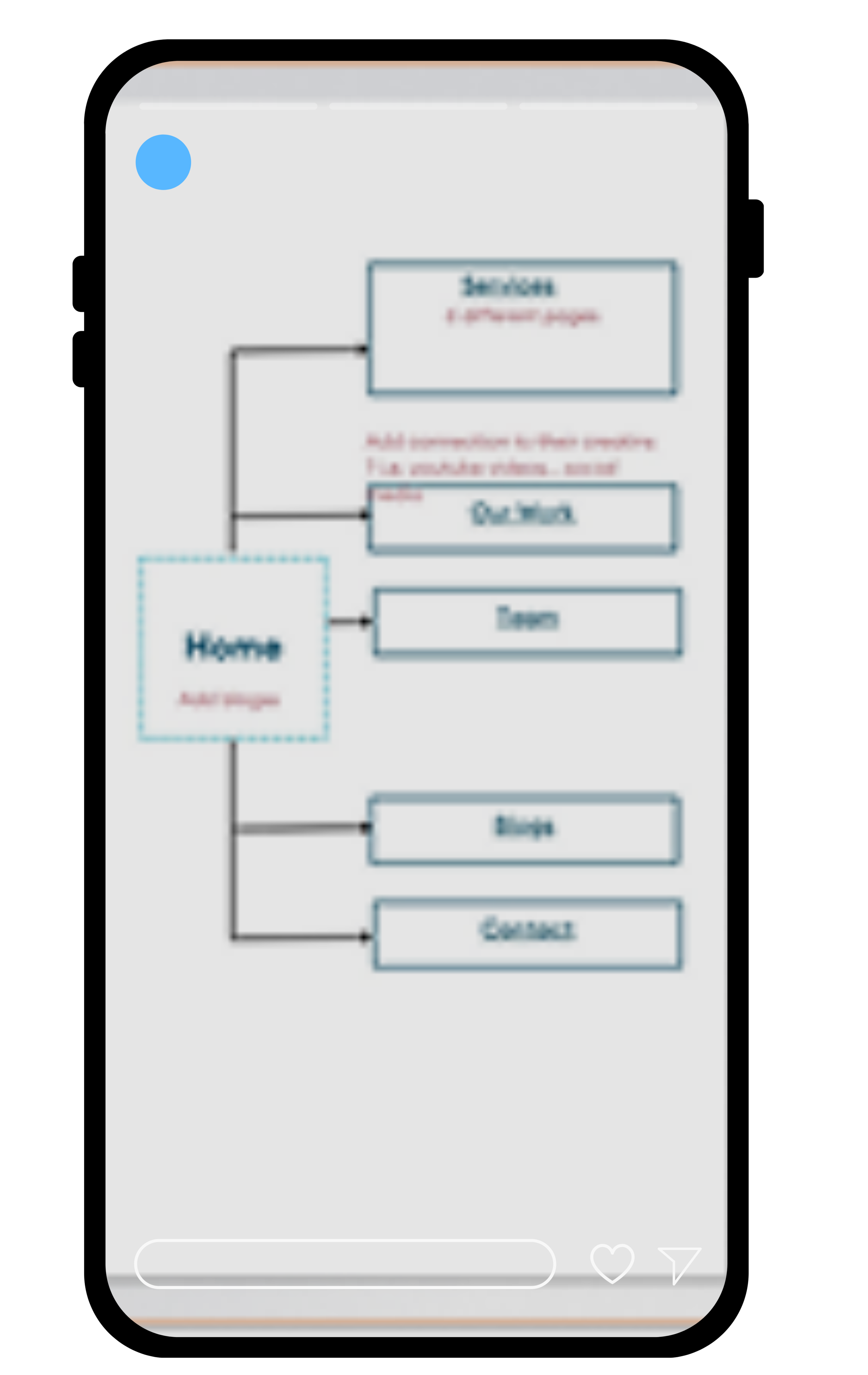
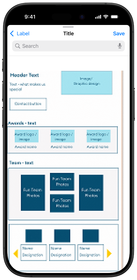
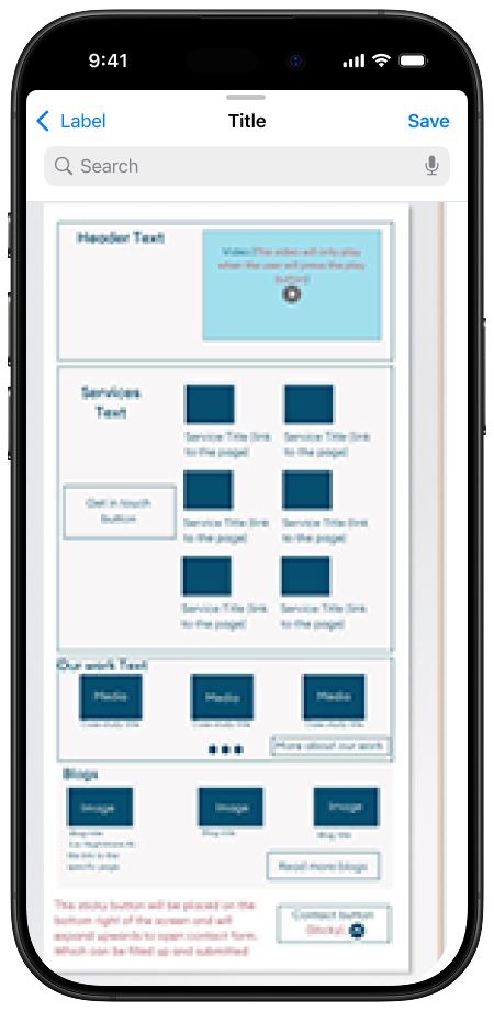
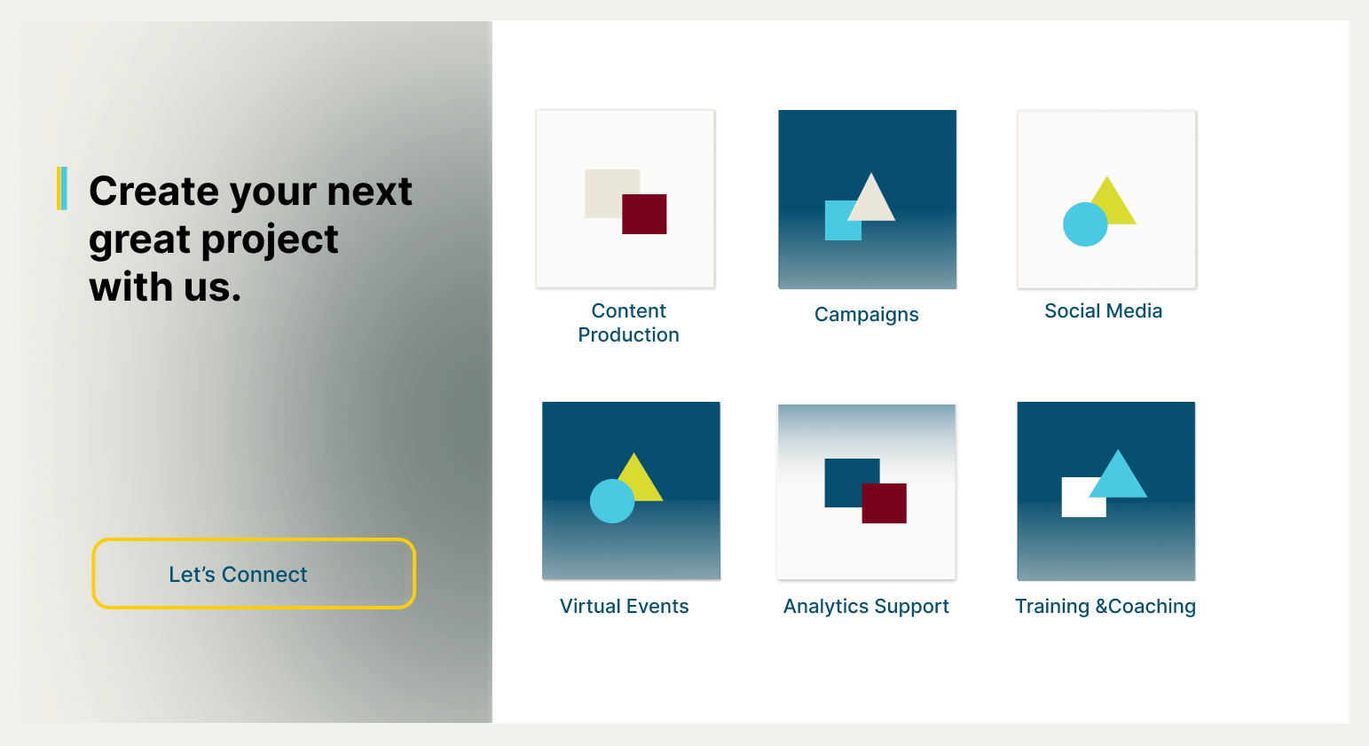
Preliminary designs & Site map
Usability testing
Approach: We ran usability tests using the research platform UserTesting, with the aim of validating the new design across both mobile and desktop experiences.
Methodology: Tests were unmoderated and task-based, using a think-aloud format throughout.
Participants: 10 participants total — five testing the mobile design, five testing the desktop experience.
Feedback:
The main structure received mainly positive feedback.
Users asked to change the contact information form, and add more privacy policy options.
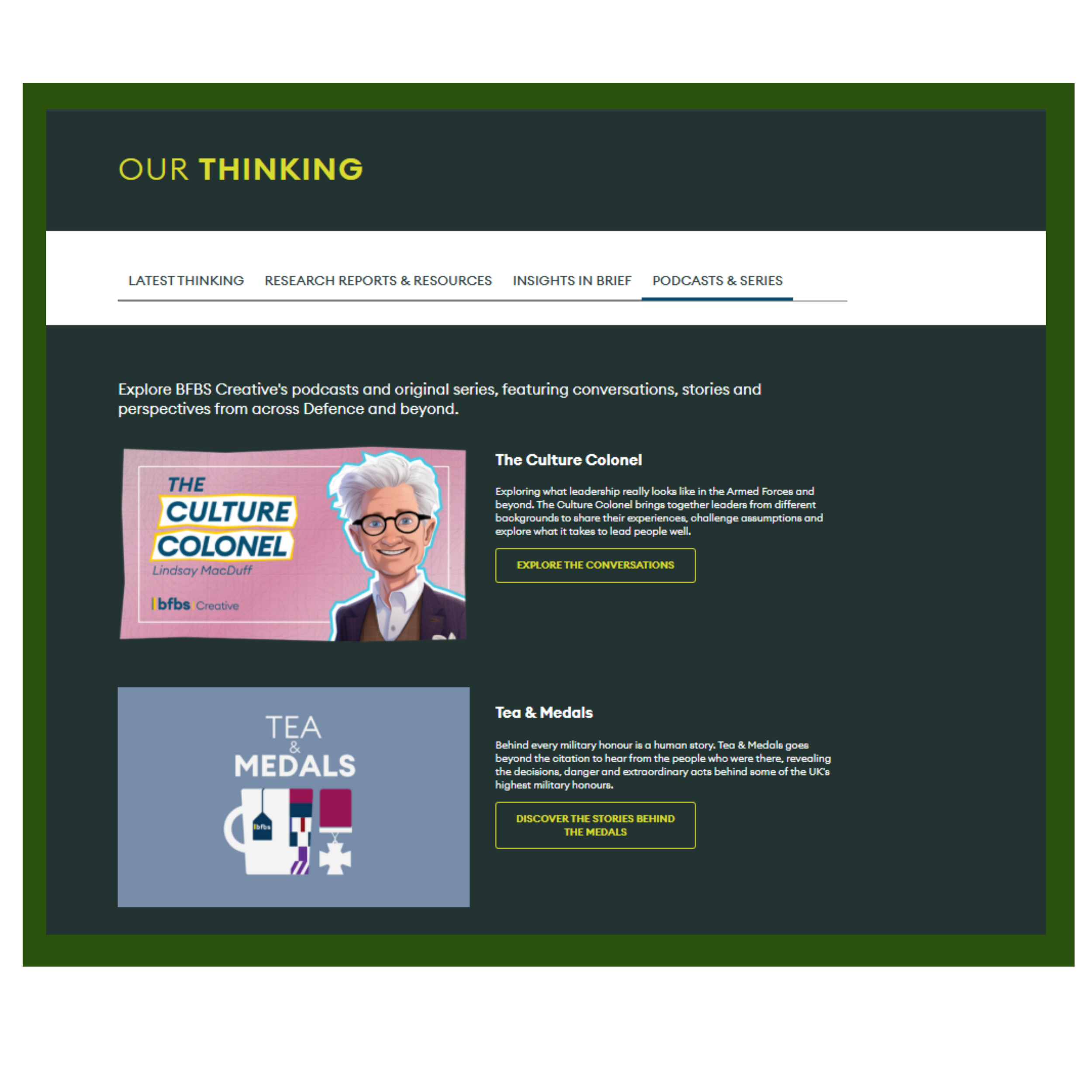
They thought the contents of the ‘Thinking’ section were too scattered.
Changes we made based on the user feedback
we added more privacy options in the contact us form
Brought all contents of ‘Thinking’ section under a tabbed group for better visual access.

“The home pretty much shows you everything. It is quite good and informative”
What our users said
“It is not overwhelming, which is important”
“I would use the words modern, engaging and attractive to describe it”
Getting ready for development
In preparation of handing over our designs to the developers, my team and I
Created a component library
Documented interactions and behaviours
Defined responsive behaviour
Review accessibility requirements
Created a handoff checklist.
Created acceptance criteria in Jira
Collaboration with the development team, QA and launch
Throughout development, I supported the team with any UX questions through regular scrum meetings, and stayed closely involved in QA to make sure the final build matched the design.
Once we were confident everything had been faithfully implemented, we moved forward with launch — and the new website went live.
Results & impacts
Since launch, the redesigned site has shown a clear shift in how users engage with it.
Engagement rate increased by approximately 60%, compared to the previous site.
Bounce rate improved by around 3% — a meaningful shift given the site's already niche, intentional audience.
User enquiries saw a significant rise.
These results reflect real progress against the goals set out at the start of the project — a better user experience and stronger conversion performance.
Visit the site: https://creative.bfbs.com/